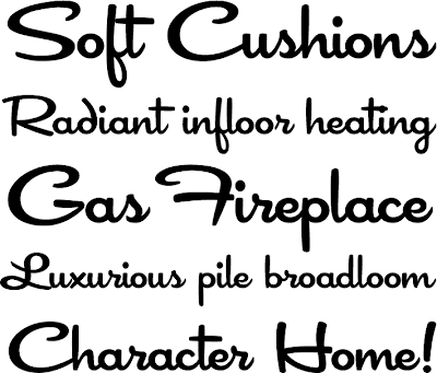
For our fonts J and I wanted something that would echo the mid-century modern aesthetic that we are hoping to infuse into our day with a dash of playfulness ala Jonathan Adler and Todd Oldham. After pouring over hundreds of fonts on Veer and Dafont we finally settled on the following-
Festiva via Veer.com
I was a little concerned that the fonts wouldn't place nice with each other and would look horrible when combined but after playing around with them in illustrator all my fears have been put aside and I'm really happy with our decision.
As for the design motif I originally was inspired by a vintage TV tray that we picked up about a year ago at a flea market. You can kinda see it in this picture peeking out from under my pom pom maker.
After some work in Photoshop I was able to come up with my own version of my inspiration patter.
I love the retro vibe of the geometric design and the pattern is simple enough that it won’t over power any of the other design placed next to it.
So what do you think? Are you feeling the mid-century retro vibe from our fonts and pattern?


love it!!
ReplyDeletelovely little details {blog}